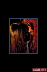
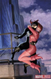
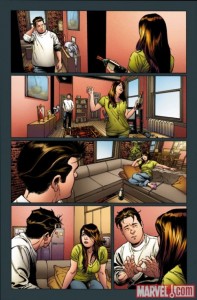
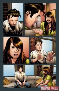
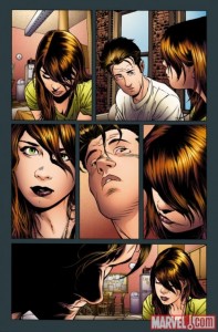
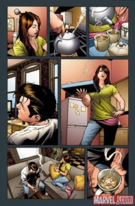
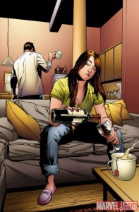
 Here are some of the pages of art from the upcoming issue, what do you think of them? Comment below. The book goes on sale July 21st.
Brad Douglas
View articlesBrad created the Crawlspace back in 1998 while attending college at the University of Missouri-Columbia. He’s the webmaster and writes front page news items, and also produces, hosts and edits the podcast. He’s been collecting Spider-Man comics since the age of three and is a life-long fan of the webhead. His website has been featured in USA Today, Entertainment Weekly and on Marvel.com and inside the comics themselves. The Crawlspace is one of the first Spider-Man fan sites to ever hit the internet. Millions of people visit the site every year.
Brad has interviewed several “Spider-Celebrities” over the years including co-creator Stan Lee. He’s also interviewed actors who have portrayed Spider-Man like Paul Soles (Voice Actor from the 67 Spider-Man Cartoon), Dan Gilvezan (Spidey Voice Actor from Spider-Man & His Amazing Friends) ,Yuri Lownthal (Voice Actor from the Spider-Man PlayStation game) and Nicholas Hammond (Spider-Man 1977 Actor).
You might be interested in …

Spider-Man Joins Darkhold Fight
Marvel sent over this press release. It seems Spidey is teaming up with Wanda to take on Doom. THE MARVEL UNIVERSE DESCENDS INTO CHAOS IN THE DARKHOLD ALPHA #1! Steve Orlando and Cian Tormey redefine […]
ASM 2 Cast on Ellen
Here are six clips from the Ellen show with the cast of Amazing Spider-Man 2.
Spider-Man 4 in 2011
It seems we’ll have to wait until May 2011 before we get another Spider-Man movie. The L.A. Times interviewed “Spider-Man” producer Laura Ziskin. She says there is no screenplay, nor are Tobey Maguire, Kirstin Dunst […]
25 Comments
Leave a Reply
Social
Recent Comments
Evan Berry on Panel of the Day #1615 (Splash Page Sunday!): “@Hornacek – Maybe Stan reserved the writer credit for himself.” Nov 18, 08:01
Hornacek on Panel of the Day #1615 (Splash Page Sunday!): “In these older issues, why is the writer sometimes listed as “Scripter”? Is this like in a movie credits where…” Nov 17, 09:09
Hornacek on Panel of the Day #1615 (Splash Page Sunday!): “I mean, eventually he’ll fall enough that he can web onto a building. This isn’t that dire a situation. Now…” Nov 17, 09:08
Evan Berry on Panel of the Day #1612 (Splash Page Sunday!): “I guess there was something different about Cindy Moon’s body chemistry, too.” Nov 11, 08:15
Hornacek on Panel of the Day #1612 (Splash Page Sunday!): “I don’t like the whole “something was different with Peter’s body chemistry” explanation here. He was bitten by a spider…” Nov 11, 04:30
Gevorg on 1994 Spider-Man #15: “Battle of the Insidious Six” Review: “Your complaints look like nitpicks and made-up. Why angry face should be indicative of seeing stone crushed?” Nov 10, 14:28
Evan Berry on Panel of the Day #1611: “I might be in the minority, but I’ve always been confused about Spider-man Noir’s wielding a gun.” Nov 8, 09:36
Hornacek on Craig’s Critique: Amazing Spider-Man #60 (Legacy #954): “Hit The Road, Zeb” or “All [REDACTED] Things Must Come To An End”: “@Paul Penna: I just don’t see any future writer “doing” anything with Paul besides having him around. Marvel wants him…” Nov 6, 09:19
Evan Berry on Panel(s) of the Day #1610 (Mary Jane Monday!): “@Hornacek — I would make a horrible Spider-man. So many times, were I in his place, I would have confided…” Nov 5, 07:53
Hornacek on Panel(s) of the Day #1610 (Mary Jane Monday!): “At least he said “I have to go take photos for the Bugle.” This is a valid excuse since this…” Nov 5, 04:26





Joe should be banned from working on spidey. OMD was just bs. Aunt May should have died.
Let me see if I’ve got this straight, the idea was to de-age Spider-man by getting him un-married… and drawing him to look like a middle-aged man with a paunch?
That cover (the second image) is Spectacular though.
Uhh is this a spiderman comic? who are these people? that certainly does not look like MJ, man why did JQ stuff up spidey, BND sucks @ss
This will be nothing but an explenation, from Quesada’s point of view, on why Peter and MJ should not be married. As others have mentioned several times, the expressions are complete, but that does not look like MJ.
Rightly put Izzy! The whole deal does seem to be getting worse for where, someone at Disney so fire the Q man. Please won’t anyone at Disney at least care about the product of comic you brought 10 months ago. I don’t like the looks of this one at all!
“This deal is getting worse all the time.”
I am going to hold off on judging this on art alone, though my gut instinct is “this is going to be disappointing”.
Like CMStimpson I had hoped that O.M.I.T. might bring back the marriage to MJ and undo all the damage caused by the fanboy run amok, Joe Q, but it seems that will never happen so long as ol’ Joey is still in Marvel’s employ.
I wish that OMIT would bring MJ and Peter’s marriage back, but I know that won’t happen. I wish that One More Day never happened, but it did. I wish that we wouldn have to refer to the deal ever again. Jesse’s right, it does look like MJ and Mephisto are going to make out. I hate the brand new status quo.
@Iron Latern – I hate to admit it, but you’re right. Those are some great expressions from MJ, even if they don’t really look like JRSR’s design.
“Bad art” and “the characters not looking like who they should” or not, Joe Q sure does do great facial expressions.
That second pic, is that the cover ? It looks beautiful
I hope it is “the story to put everything back together as it was”, but by looking at these pages it seems to be a long road till then.
Cover art is good..interior art is a step up from manga…characters “don’t look themselves”…but hey it’s the heroic age…tararaboomdeyay…..40 years never happened… inner sadness continues:(
That is some of the ugliest art I´ve ever seen. And is it just me, or do they seem high in those pictures? XD
well the cover looks fine, just the art makes peter and MJ look fat around their faces. then again it may not be MJ cos it sure doesn’t look like her
I’m looking forward to the book, and I like the layouts and look of this conversation. I just don’t think that looks like Mary Jane.
that cover is poignant
Artwork is good. I like it.
it looks like MJ is gonna start making out with Mephisto….
Yeah, MJ, I know how you feel…I need a drink after looking at this, too!
…well, the cover looks nice.
hey, joe! where did the famous MJ dimples go? y’know, the ones John Romita Sr drew? I see you still have your characters make with the droopy faces!
Just looking at this is indeed kind of sad… just feels like between the two of them Peter is the one that screws up everything.
What a moron I mean its Mary Jane.
MJ: *whispering* “Taste the rainbow.”
This no puns intended, “hurts my soul” looking at this. It just makes me sad.
“Pst. I really, really like pizza bagels.”