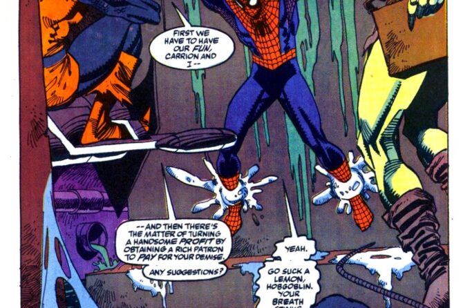
Here we go again!
Sensational Spider-Man (Vol. 1) #0
Published: c. November, 1995?
Cover Date: January, 1996
“Ultimate Commitment”
Writer: Dan Jurgens
Artist: Dan Jurgens
Inker: Klaus Janson
Letterer: Richard Starkings and Comicraft
Colorist: Gregory Wright


Funny, I always thought Scarlet’s hoodie had the spider centered and that they made a mistake in the recent series, but now that you’ve mentioned it and I checked, it was actually a bit on the left in the original too! I never realized it, probably due to perspective.
(in the series by PAD they still drawn it wrong because they shrank the spider symbol, but at least the position was right-ish)
@Aqua and @Evan. Ya I was wandering the same about the off center spider. I guess it’s an “hommage” to his Scarlet spider costume? The spider is off center on it too.
You are right about the spider on the back. It’s weird.
As for looking more black, it was the same with his first Spidey costume. Some artist made it look more black than blue (the cover of sensational spiderman 4 is a perfect exemple of that). I guess it’s up to each artist.
Now that you mention it it does look a lot like Spock v2 suit. But to be fair Spock v2 suit had a lot of cues from Ben Spidey suit. So who is imitating who is hard to tell :p
@ Aqu@ — I’m glad you noticed that Ben’s new suit as the spider off-center. I wondered if that was the way he was standing or a trick of my eye. Since I’m so used to seeing it centered, it made the proportions look off or something. I guess I’d better get used to it!
@Sthenurus: not enough for me. Granted, we saw very little, but it would seem the color is more toward black than blue (or at least a very dark tone of blue); the spider on the chest is not centered and symmetrical, it seems smaller and placed more on the heart. And from the black and white sketch, the back seemed pretty different. Also, legs and wrists (webshooters aside) are quite different, more in line with classic amazing.
As it is, it reminds more of the Superior second version, a peculiar likeness considering what we know so far about Ben’s motives.
That said, I won’t judge a book from its costume-erm-cover, like many did with ScarletSpider by PAD (something that in my opinion contributed to its demise).
Now that Dan Jurgens has been doing Marvel work, maybe we’ll get him back on Ben for Beyond?
Always loved the Sensational suit, and Sensational Spider-Man #0 was such a fun way to kick start the Spider-Ben era. The subsequent, white variant covers for Ben’s first Spidey appearances were also awesome and really gave him a good start to his career.
@Aqua while different what (little) we saw from his new costume seems pretty similar. I’ll miss the external webshooters though
@andrew Thank you!I 100% agree with you. There was some phenomenal stories (web of carnage, redemption and -of course- revelations!) while the duds were pretty rare. Unhopefully most people can’t get past the very bad middle of the clone saga, even if the beginning and end where fault good (hell ASM 400 is a masterpiece).
I really hope that with Ben coming back as Spidey people will re-evaluate the clone saga and see it for what it was: a flawed story bogged down by editorial but with moments of brilliance.
While the middle of the clone saga (from ‘Smoke and Mirrors’ in early 95, through Maximum Clonage, to the end of the Scarlet Spider issues in late 95) was indeed pretty awful, I’ll always defend the last year of it when Ben took over as Spidey. There was less emphasis on the clone mythology, and more solid and lighthearted stories with Spider-Ben that deserve a reappraisal (especially the Sensational run, first with Jurgens and later with Dezago/’Ringo). But unfortunately it too often gets lumped in with the rest of the mess.
Always liked Ben’s costumes. This one in particular, I find enthralling. Maybe it’s all the blue.
A pity the new costume he is going to wear seems different.