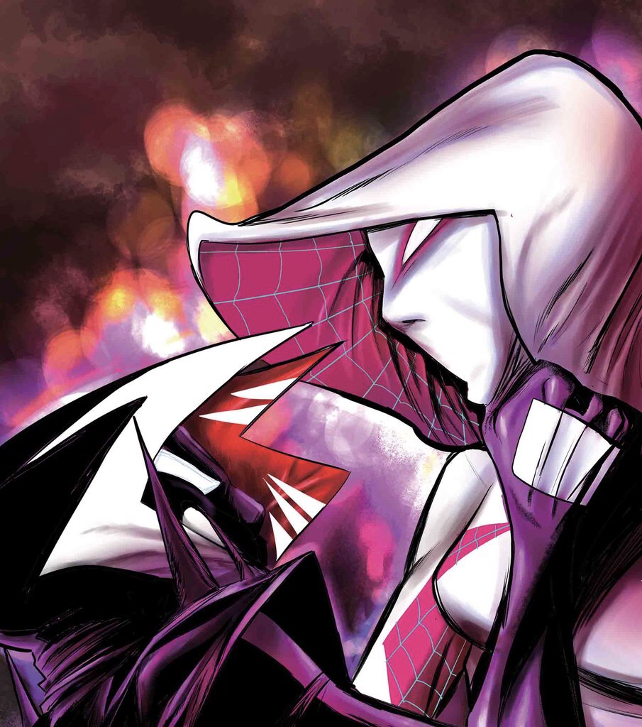
After a two months break, I return to review both Champions 7-8 and give my quick thoughts on Secret Empire: Uprising. While I enjoyed the character work by Mark Waid and Humberto Ramos and great use of Miles Morales. The story still leaves a few holes.


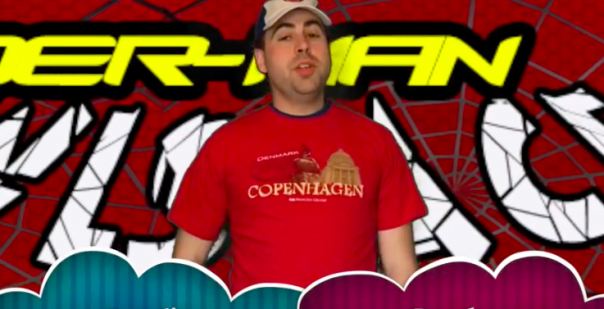
It’s a new pop up that is more reflective in my spare bedroom which was painted green when we got the house. While the main Green Screen is more reflective so it picks up light better. Then having the green around me in the rest of the room allows for me to edit my backgrounds faster. I typically using Doink App or iMovie/Screen Flow for the adaptions. Makes it very clean. I have wanted to try Adobe Premiere, but I don’t have access to it.
Do you just use a green sheet and tack it up? It works really well. What program are you using? Adobe Premiere?
Yes, this has been nice work by Ramos in a long time. Not up to Outcasts, but much better than what he did on Spider-Man the last few years. This is a new set up for the Green Screen, so I’m trying to use it more often.
I like the use of your green screen on this latest review. It really adds to it. Good job! I have these two issues, but haven’t read them yet. Champions has be so-so in my opinion. I dig Ramos’ art.