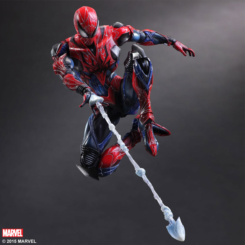
 iO9 has posted a look at the new Play Arts Kai Marvel Spider-Man action figure from Square Enix – and they were puzzled as to why this figure needed Spider-Armor. As am I.
But then again, there’s the four little metallic pieces of armour covering his shoulders and then an extra two pieces… on either side of his pecs? I have no idea why they’re there. I guess the argument against any sort of Spider-Man armour is that his Spider-Senses let him dodge things easily enough so he doesn’t need it, but even if Peter Parker did need armour, I’m sure he’d use a lot more than just six tiny pieces that doe a really bad job of actually protecting anything vital. Giant Spider-shaped bullseye over his vital organs? Fine. But thank god a third of his pecs are armoured! It breaks up the colour scheme of the figure for no real reason, and just doesn’t add anything to the design at all. Needless tinkering on a great looking figure otherwise.
What do you think, Crawlspacers? Is this armor rad or is this armor bad?
–George Berryman!


Looks like a Guyver/Kamen Rider-styled Spidey. I can dig it.
ONE HUNDRED NINETEEN DOLLARS?!?!?!?
http://www.bigbadtoystore.com/bbts/product.aspx?product=SEP10525&mode=retail
Te latest Marvrel Legends Spideys ave been surprisingly good.. With interchangeable hands.
I hate their figures.
I just want to see a vaugly normal spidey be done by someone like bandai.
I love the figma spidey but hate that costume.
hopefully sentinal will start doing comic versions of other characters like they are doing with Ironman.
You’d have to be a fan of Play Arts Kai. Whic I am.
BTW, the price range will probably fall within $50-70, so Brad’s out.
For those who have no idea what I’m talking about when I mention Tiger & Bunny well here’s the second intro. The main character is practically MC2 Spider-Man and the story is him meeting a young Batman. As a Spider-Man fan you owe it to yourself to look into it. If you have a PS3 or a PS4 well Playstation Network has all of the episodes in English. GO GO GO! https://youtu.be/8iVPuVUbFe8
As someone who loves anime, especially mecha anime, I find it to be pretty ugly. The design looks too busy and well… over-designed, like twenty different people had a stab at it and each just kept adding more lines and new bits of armor.
I think it looks great. As stated above, it fits in pretty well with the rest of their line! Practicality has nothing to do with it!
Squeenix is going mecha that’s all. Heck if you ever watch the anime Tiger & Bunny all this Spidey needs is corporate logos and he’d fit right in ha ha!
I think it looks pretty cool and in-line with the rest of the Play Arts Kai figures. Definitely reminds me of the Ends of the Earth Armor to a certain extent, though that’s probably because of the armor parts.
If you are familiar with Square Enix, specially their aesthetic style, these choices won’t surprise you in the slightest. lol
It vaguely reminds me of the Ends of the Earth armor
Sounds like someone’s first Spider-Man comic was Web of Spider-Man #100
I like it, just because it’s different that other previously released figures.