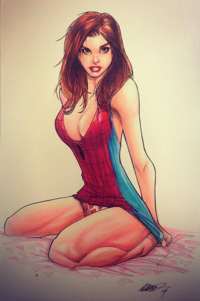
 Here’s a great piece by current Amazing Spider-Man artist Humberto Ramos.
You might be interested in …
Spider-Art #60
Bob Larkin! That’s the guy from yesterday’s picture. Thanks to the commenters who clarified that for me.
Spider-Art #115
Not by the actual Dr. Seuss.
Spider-Art #103
Here’s a piece by Ted Brandt, friend of our friend Kevin and cover artist for Kevin’s Crawlspace comic!
16 Comments
Leave a Reply
Support the Crawlspace on Patreon

Crawlspace Discord

Recent Comments
on Craig’s Critique: Amazing Spider-Man #70 (Legacy #964): “The 8 Deaths of Spider-Man. Part 10: “Nothing Can Stop The Spider-Naut”: “@Evan Berry: “A Huey Lewis and the News reference is always very much appreciated.” Throughout this story I was hoping…” Mar 31, 08:46
on Craig’s Critique: Amazing Spider-Man #70 (Legacy #964): “The 8 Deaths of Spider-Man. Part 10: “Nothing Can Stop The Spider-Naut”: “@Hornacek — I’m sorry I’m a little late getting to this review. This was a really good one, as always!…” Mar 31, 07:41
on Craig’s Critique: Amazing Spider-Man #70 (Legacy #964): “The 8 Deaths of Spider-Man. Part 10: “Nothing Can Stop The Spider-Naut”: “One deviation is just an anomaly. Two would be an act of God. So, Peter got all that power and…” Mar 30, 21:03
on 1994 Spider-Man episode #55-“Unclaimed Legacy” Review: “Why can’t you get over KP wanting immortality? Why shouldn’t a villain want it? I don’t mind Doc Oc taking…” Mar 30, 05:15
Recent Amazing Spider-Man Reviews
Spider-Satellite Reviews
Subscribe to the Spider-Man Crawlspace Podcast

Another crappy art by Ramos.
*Sigh* The MARVEL publishers needs to hire Giuseppe Camuncoli to do the pencling for Amazing Spider-Man. Ramos’ art is not suitable for the comics
Another crappy art by Ramos.
*Sigh* The MARVEL publisher needs to hire Giuseppe Camuncoli to do the pencling for Amazing Spider-Man. Ramos’ art is not suitable for the comics
Why aren’t Peter and Mary Jane together again? Oh right Marvel……
Well, it’s better than his usual but it’s still turrible.
Yeah, her thighs look strangely massive. When your thighs are bigger than your waist, you should probably consult a doctor.
And regarding her eyes, I agree that this drawing is not on the level. Sorry, I’ll just show myself out.
Damn! She really needs to get to a hospital. I think her left boob deflated into her right boob. That probably whats making her eyes look like that.
hehe, yeah, it’s an ok picture, I like it. But man, I’m so tired of the key book of Spidey being drawn by Ramos. His JJJ in this last issue was just terrible looking… and sadly that’s all I really can remember about the issue. Well that and this Black Cat crap Slott is trying to pile on us. Why didn’t they reboot (again) with a new writer and a new artist? Sad Spidey is sad. :-/
OK… rant mode off.
Keep On Thwipin’!!!
Sam
This is everything about why I can’t stand Ramos’s art. He doesn’t seem to have any regard whatsoever for the proportions of a human body. It’s a cliche, but you have to understand the rules of an art before you can bend them, and I really think Ramos’s style is to bend rules without actually having a clue what they are.
Hmmm….. this looks much better than the weird-looking cartoony MJ which he drew on AMAZING SPIDER-MAN #3. He needs to draw MJ just like this Spider-Art in the comics.
Hmmm….. this looks much better than the cartoony MJ which he drew on AMAZING SPIDER-MAN #3. He needs to draw MJ just like this Spider-Art in the actual comics.
Her eyes are not level. Her nose just looks wrong. Her breasts are different sizes. And her thighs look strange compared to the rest of her body. It’s better than anything I can draw, but I’m not a artist. I’ve seen better MJ’s.
Yeah the eyes aren’t necessarily level, but that’s really my only problem with it.
It’s so funny how I hate his Black Cat but love his Mary Jane. He just seems more interested in drawing her female form artistically rather than making it fanwank.
Her eyes are askew, like Alfred E. Neuman!
You weren’t kidding! This might be his best MJ ever!
But, but, her right eye is somewhat shifted compared to the left one.
This is a nice piece. Has anyone noticed that Ramos seems to put more effort into drawing female characters?