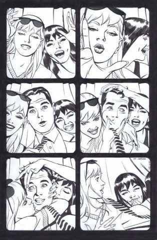
 I couldn’t resist. More Steve Rude Lee/Romita era Spidey art.
Donovan Grant
View articlesTypical college aged comic fan who wants to write and draw in the biz
You might be interested in …
Spider-Art # 188
by Brad Douglas
The black and white image is a commission from John Romita senior. It’s a re-do of his Amazing Spider-Man 282 cover.
Spider-Art #100!
It’s that time again! To celebrate the 100th Spidey-Art entry, I’m gifting onto you voracious viewers glorious pieces from John Romita Sr.!
Spider-Art #93
It’s hard for me to make out the penciller credit, but the inks were done by Brett Breeding.
7 Comments
Leave a Reply
Social
Recent Comments
Evan Berry on May 2025 Solicitations: “I love a good Hobgoblin story. I must say I’m surprised to see that Norman Osborn is still considered one…” Apr 3, 12:34
Evan Berry on Spider-Previews 04-02-25: “I may or may not have accidentally seen a spoiler for the reveal of who Venom is, and I really,…” Apr 1, 14:13
Gevorg on 1994 Spider-Man episode #56-“Secrets of the Six” Review: “I thought last episode Vulture was traitor for taking aircraft alone. And why would any member of Six save the…” Mar 31, 15:59
Hornacek on Craig’s Critique: Amazing Spider-Man #70 (Legacy #964): “The 8 Deaths of Spider-Man. Part 10: “Nothing Can Stop The Spider-Naut”: “@Evan Berry: “A Huey Lewis and the News reference is always very much appreciated.” Throughout this story I was hoping…” Mar 31, 08:46
Hornacek on Craig’s Critique: Amazing Spider-Man #70 (Legacy #964): “The 8 Deaths of Spider-Man. Part 10: “Nothing Can Stop The Spider-Naut”: “@Dark Mark: “One deviation is just an anomaly. Two would be an act of God.” I feel like George has…” Mar 31, 08:33
Evan Berry on Craig’s Critique: Amazing Spider-Man #70 (Legacy #964): “The 8 Deaths of Spider-Man. Part 10: “Nothing Can Stop The Spider-Naut”: “@Hornacek — I’m sorry I’m a little late getting to this review. This was a really good one, as always!…” Mar 31, 07:41
Dark Mark on Craig’s Critique: Amazing Spider-Man #70 (Legacy #964): “The 8 Deaths of Spider-Man. Part 10: “Nothing Can Stop The Spider-Naut”: “One deviation is just an anomaly. Two would be an act of God. So, Peter got all that power and…” Mar 30, 21:03
Hornacek on Craig’s Critique: Amazing Spider-Man #70 (Legacy #964): “The 8 Deaths of Spider-Man. Part 10: “Nothing Can Stop The Spider-Naut”: “@Dark Mark: Thanks again for the kind words. “I feel pretty safe on saying that as long as George is…” Mar 30, 20:00
Gevorg on 1994 Spider-Man episode #55-“Unclaimed Legacy” Review: “Why can’t you get over KP wanting immortality? Why shouldn’t a villain want it? I don’t mind Doc Oc taking…” Mar 30, 05:15


Well he was dating her when she was alive…
Am I wrong for being slightly offended that Gwen is front ans center while MJ’s reduced to sitting in the back?
I love this. So much personality and movement brilliantly captured by Steve Rude. It’s so fun to look at.
@EddieD:
Steve Rude did a 3 issue Spider-Man mini series called “Spider-Man: Lifeline” back in 2001.
It revolved around the classic Tablet of Life storyline from ASM #73-75, back in the late 60’s…and the art definitely reflected it (although the costumes didn’t).
http://spiderfan.org/comics/title/spiderman_lifeline.html
This makes me wonder how awesome a Steve Rude Spidey book would be.
Nice! The way the Spidey Gals are drawn reminds me a lot of Patrick Nagel’s artwork, of which Peter too was a fan of, judging by the poster he had in his living room in the 80s. Also, hoping for such fun and frolic scenes between Peter and the girls to be featured in the ASM sequel, before things take a turn for the really dark.
The way this is set up layout wise it’s that Peter and his gals are in one of those mini photo booths on a date at a amusement park. Even though he wants to be part of the gals photo model he’s running away not because he’s shy but because he’s needed as you know who?