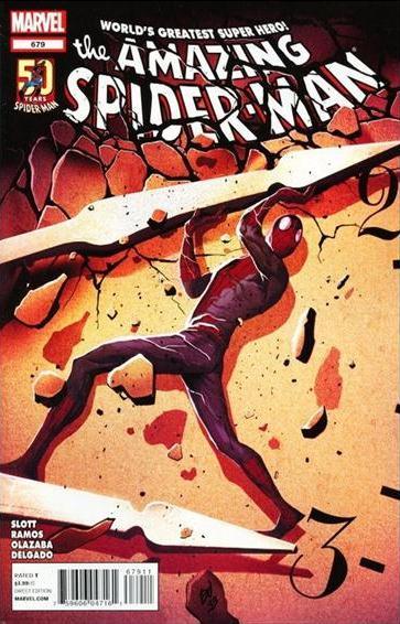
 Time is running out for both Spidey and the rest of New York! Can he figure out how to stop the doomsday future before the clock strikes 3:10? Or will he need a little help from his friends?
“I Killed Tomorrow Part 1: A Date with Predestiny”
Written by Dan Slott
Illustrated by Humberto Ramos
Inked by Victor Olazaba
Colored by Edgar Delgado
Lettered by VC’s Joe Caramagna
THE PLOT: Spider-Man and Grady Scraps panic as 3:10 passes without any indication of the doomsday event that would destroy New York. After nothing happens, they surmise that the event would occur at 3:10 a.m.
LONG STORY SHORT: After a brief talk with Mary Jane, Peter figures out that the event was caused due to the door being held open the entire time. He and Grady shut it in the nick of time and save New York City.
MY THOUGHTS: Another issue that I really enjoyed, this is the kind of stuff I can appreciate from Dan Slott as it makes me understand why his run is so lauded these days. It’s nothing heavy, nothing earth-shattering, nothing continuity porn-y, just fun, simple superheroics. While this issue was a lot more straightforward and simple compared to part one, I ended up liking it more for one slight reason. Let’s get right into it.
First the cons…and…there aren’t any! Really, there was nothing in here that remotely bothered, bugged or irritated me in any serious way. I could bring up Slott’s slightly hackneyed dialogue concerning Silver Sable and Flag Smasher, but that’s completely going with the tone he set for the story. I could nitpick about the repeated Doctor Who love, from the namedrop in the last issue to something only serious Whovians would know about and Grady cosplaying as Tom Baker in this issue, but that only distracts if you are a fan of Doctor Who. Seeing as how I am, it didn’t bother me much either. It wasn’t all that intrusive, and in all honesty I would’ve probably done the same thing if I was writing the story.
 I suppose the most infamous part of the story was the Sable/Spidey kiss. Upon first reading it, it didn’t bug me at all. I could honestly see this scene playing the same in the 90s when Pete and MJ were still married. It’s the kind of thing that’s been played in Spidey’s adventures with female characters before. The question is though, does that make it true to the characters? Well, maybe not. I do admit that it’s pretty idyllic for a super hero; kiss from the hot foreign diplomat after saving her country’s pride day. I’m of two minds of it honestly. On the one hand, I really don’t think it debases Silver Sable in any way. Spidey did save the day, and it was just a kiss. I think it mainly has to do with the art, where Ramos draws her totally sucking Spidey’s face off. Perhaps if he drew it with less overt body language and made the kiss less full-on. That probably would’ve been better. Perhaps a kiss on the cheek would’ve been more appropriate as well. I dunno…is it out of character for Sable to do this? I honestly don’t think so, and that’s not me insinuating she’ll do this with anyone. She and Spidey are very familiar with each other, and it didn’t seem like crazy flirting to me. Your mileage may vary however…
Ramos is still doing awesome work on this book. I talked about him staying too long in the Sinister Six issue, and that may be true. I was first introduced to him through the “Death in the Family” Green Goblin story back in 2002 in the pages of Peter Parker, and that story was a lot more restrained in tone. It had somber, creepy, subtle moments that made his artwork shine. Ramos does fight scenes in a very hectic and exciting manner, which is consistent for his art style, but I do like his slower issues better. Stories like this give him a chance to make the characters look nice and dynamic as they’re body language isn’t pushed as much with any scenes of crazy combat. Case in point, I think Peter looks great in this two-parter. He looks strong without being overtly muscular, he’s standing tall and confident, and he looks like Peter Parker. With the many varied styles of today’s artists, that’s not always a consistent trait in a Spider-Man comic. Similarly, Mary Jane looks awesome as well. As a coloring move, I prefer to see her hair mainly inked black with streaks of red lined in. That always looked more appealing, more sexy to me, and Olazaba and Delgado deliver along with Ramos. The whole diner scene made her just jump off the page. I thought she looked fantastic, and it was managed without her taking her clothes off! WHAT A TWIST! Seriously though, the art team wrecked it on all charts, and deserve some serious props.
Staying with Mary Jane, Slott easily writes her the best out of all the BND writers since OMD, and very rarely do I feel she’s done a disservice. She’s not (always) a travel agent for a guilt trip, she’s not a woman for Peter to hopelessly pine over, she’s his friend. I told Steve Wacker back in SDCC 2011 that while I do prefer them married, I have no complaints about their relationship here if this is how it’s going to be. Her and Peter teaming up to save New York was the best part of Spider-Island, and it’s great to see that momentum continued in the issues since.
I suppose the whole doomsday doorway plot wasn’t all that hard to figure out in its solution, but that never mattered to me. The artwork and writing was entertaining enough that I was never invested in how the day was saved but in watching it get there. It’s a narrative mystery. You know what the answer to the central question is, but you don’t know how the journey to reach it will be like. This two parter wasn’t the best thing since sliced bread, but it was the kind of breezy Spider-Man story I can just sit back and enjoy on any given day. Great artwork, great writing, great characterization, great story overall.
4.5/5 webs


… and in ONE panel no less….
I liked that the long awaited F.A.C.A.D.E. appearance came and went and nobody still cares…. hahahahahaha…
Good review, Don!
Good story… nice review.
@2-Shaun: That happened in Peter Parker: Spider-Man, during Paul Jenkins’ run. It was released in a trade called “Return of the Goblin” Honestly, I disliked a lot of the art in that issue. I think how Ramos drew the Green Goblin was fine, but there are lots of weird looking Spider-Mans.
I like that cover, pretty cool.
i liked this issue also, and i love mj. get ’em back together.
Nice review, I’m totally on page with everything you said.
Way to name drop though Don, couldn’t stop yourself from the whole “I talked to Wacker” thi… Nah, I’m just kidding.
Nicely done review, what series was the “Death in the Family” arc from? I’ve seen pictures of it, but never seen the actual story.
An unbiased website would have given this a 5, I’m assuming.