Brad Douglas
View articlesBrad created the Crawlspace back in 1998 while attending college at the University of Missouri-Columbia. He’s the webmaster and writes front page news items, and also produces, hosts and edits the podcast. He’s been collecting Spider-Man comics since the age of three and is a life-long fan of the webhead. His website has been featured in USA Today, Entertainment Weekly and on Marvel.com and inside the comics themselves. The Crawlspace is one of the first Spider-Man fan sites to ever hit the internet. Millions of people visit the site every year.
Brad has interviewed several “Spider-Celebrities” over the years including co-creator Stan Lee. He’s also interviewed actors who have portrayed Spider-Man like Paul Soles (Voice Actor from the 67 Spider-Man Cartoon), Dan Gilvezan (Spidey Voice Actor from Spider-Man & His Amazing Friends) ,Yuri Lownthal (Voice Actor from the Spider-Man PlayStation game) and Nicholas Hammond (Spider-Man 1977 Actor).
You might be interested in …
SDCC: New Marvel Legends Figures
It seems like every year we get a new series of figures announced at San Diego Comic Con and this year was no different. Among the new figures announced were: Phil Urich Hobgoblin. Amazing Spider-Man […]

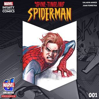
‘SPINE-TINGLING SPIDER-MAN’ INFINITY COMIC LAUNCHES ON MARVEL UNLIMITED
JUST IN TIME FOR HALLOWEEN…‘SPINE-TINGLING SPIDER-MAN’ INFINITY COMIC LAUNCHES ON MARVEL UNLIMITED ON TUESDAY, OCTOBER 26 New issues of the 8-part series will be available every other Tuesday, exclusively on the app Listen to the comic’s official theme […]
24 Comments
Leave a Reply
Social
Recent Comments
ac on Panel of the Day #1663 (Splash Page Sunday!): “That sounds vaguely familiar. That happened after the clone saga right? I quit the comics for a while after the…” Apr 29, 07:17
Hornacek on Panel of the Day #1663 (Splash Page Sunday!): “@AC – The explanation in the comics was that the Wizard (Sandman’s former team member) was disgusted by his turn…” Apr 29, 06:54
AC on Panel of the Day #1663 (Splash Page Sunday!): “I couldn’t agree more about the Sandman. I didn’t care about this character either UNTIL he turned good, I even…” Apr 28, 20:35
Hornacek on Panel of the Day #1663 (Splash Page Sunday!): “As someone who read this in the realtime, I enjoyed Sandman’s evolution from villain to non-villain to Sable employee to…” Apr 27, 09:31
Dark Mark on Panel of the Day #1663 (Splash Page Sunday!): “Ok, ok – I’ll wear my glasses next time I respond…” Apr 27, 09:21
Hornacek on Panel of the Day #1663 (Splash Page Sunday!): “I don’t know who anything about this Laden so I have no opinion on their art.” Apr 27, 09:19
Dark Mark on Panel of the Day #1663 (Splash Page Sunday!): “I don’t care one what of the other about Sandman. I just really hate Laden’s art. Always have.” Apr 26, 21:32
Fra X on Arachnid Analysis: Reflections of a Jackal: “I wonder why Professor Warren has aged so suddenly!” Apr 26, 04:34
Dark Mark on Read’s Reads Amazing Spider-Man #2/966: “Ryan, I think I figured of what bothers me with this run so far – we are getting Peter, Which…” Apr 24, 21:01
Gevorg on 1994 Spider-Man episode #64-“I Really Really Hate Clones” Review: “Wasn’t Ben the only clone, and others just multiverse variants? Considering this is alt. reality, maybe this Kingpin and Smythe…” Apr 21, 10:16


@Web-head
We know… we just don’t care… and we’re getting a little fun out of it.
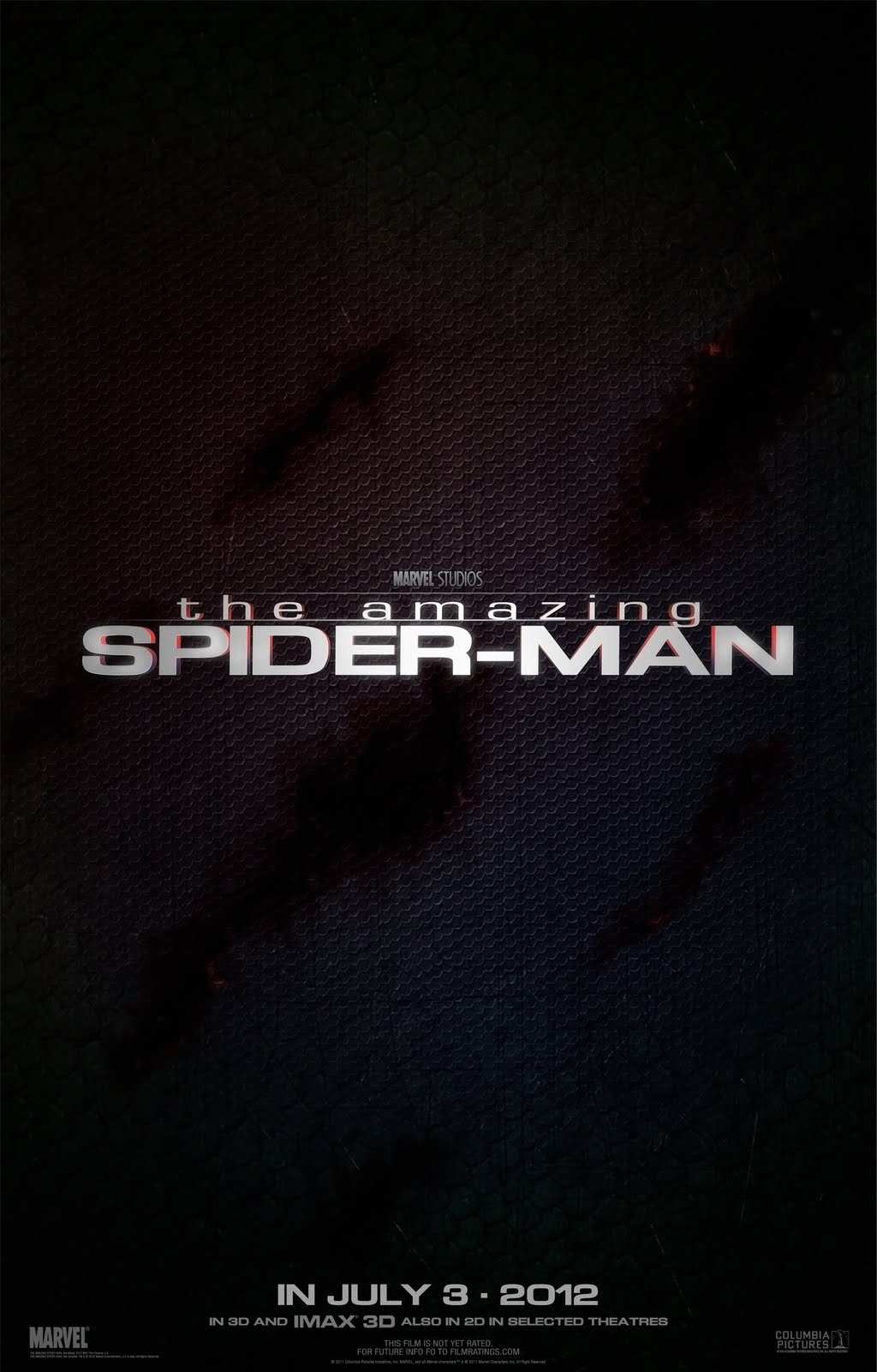
It also has Columbia pictures in the bottom right corner.
“Theatres” wasn’t what I was referring to, really.
At the bottom it says “for future info FO to filmratings.com”
Once again I’ll say it is fake. I even have the link this time. http://www.latinoreview.com/news/banner-scaly-teaser-poster-for-the-amazing-spider-man-13660
Must have stayed up all night designing that one.
Not much of a poster.
Yeah “theatres” is not the way that should be spelled. I was wondering why they would put out such a bland poster.
I’m sooooo pumped for this movie right now. Can’t you tell?
IT’S FAKE. LatinoReview debunked it.
Not to mention the spelling errors at the bottom.
Come on guys, really?…..
Lazy.
They could have at least put the burns in a Spider like design or something…
Guess they’re trying to cover up that horrific new costume and bank on name recognition alone… heh.
What do I think? I think they did a better job hiding the costume this time…
It looks like someone bled on a basketball.
I myself think with all the internet leaks all around the web, WE as TRUE SPIDER-FANS should be infused with Excitement no matter IF the minuses out weight the pulses of what the final product will yield in the end. I have never seen this site as a FAN BASE SITE BE Negative set on the greatest superhero created by living legend comic writer Stan Lee! Also it is finally good to see my own facebook icon of facebook fans.
It’s a…. black background with white letters. Wow…. way to get those inspirational creative juices flowing, Sony. [/sarc]
They’ll be making a second, a third, a fourth, a fifth… and so on and so on… as the movie gets closer. This is just the teaser poster put out a year in advance to get people talking. Sadly there’s not much to talk about with this poster since there’s so little to it. Even the font is boring… the background leaves a lot to be desired. Only a hand full of people will know that its supposed to be a costume with slash marks on it because of the picture we were given of Pete in costume a ways back. I’m surprised they didn’t just use that image as the first poster. Nothing about this picture makes me think “Spider-Man”
i hope they make a second poster
Marvel Studios is helping back it, the same way they are with the new X-Men movie this summer… but they’re not the main studio behind it at all
Really, really boring design, not impressed.
Always nice to see the “-” in Spider-Man.
pretty lame poster. is that supposed to be his suit in the background or scales? And from a distance it makes me think of Kraven. Looks kinda like his animal print.
Oh, yeah…NOW I’m excited to see this movie…{sarcasm}
Looks fake but if it is the real deal it looks bland and of course not interesting at all.
And yeah, it should be saying Sony and not Marvel Studios due to ownership of the properties.
I’m pretty sure that marvel studios is still involved a little bit and they are playing up their involvment due to marvel studios succses. also i think it’s spider-mans ripped costume
fake. Marvel isnt making the movie, sony is. and what is that supposed to be , clouds?
Weird that Sony is putting the “Marvel Studios” banner above it. I thought “Marvel Studios” was only for the properties that Marvel still owned?