—————————————————————————————————————————————————————————————
AMAZING SPIDER-MAN #643
“Origin of the Species, Part 2”
Writer: Mark Waid
Penciler: Paul Azaceta
Inker: Paul Azaceta
Colorist: Javier Rodriguez
“Spidey Sundays”
Writer: Stan Lee
Penciler: Marcos Martin
Inker: Marcos Martin
Colorist: Muntsa Vicente
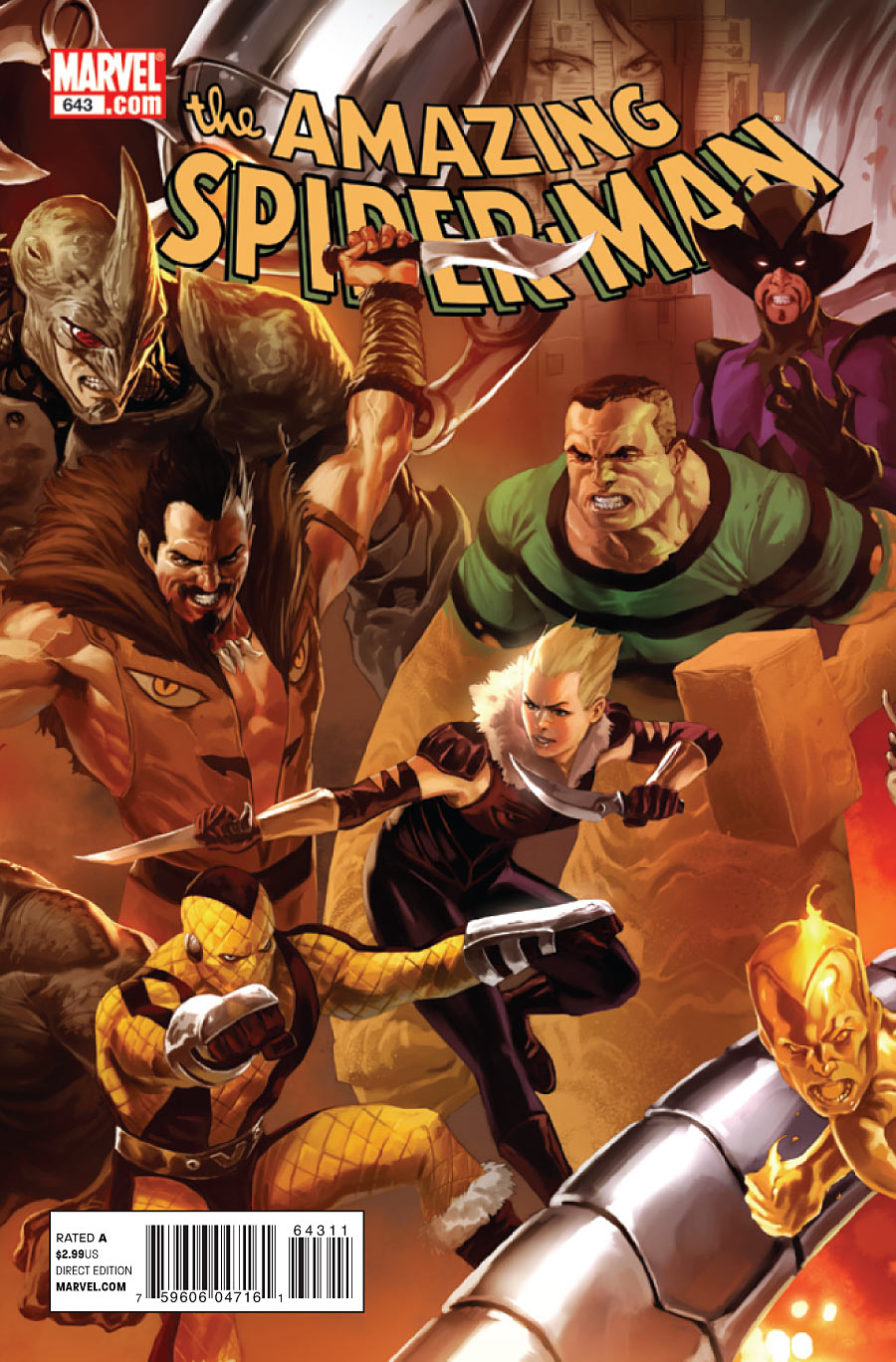
Cover Art: Marco Djurdjevic
Variant Cover #1: Phil Jiminez and Frank D’Armata
Varaint Cover #2: Leonel Castellani
Be warned – there are SPOILERS ahead!
The Plot
Doctor Octopus has delivered the baby of Lily Holister and the incarcerated Norman Osborn, but Spidey snatches the kid and takes off. Ock unleashes the supervillains to follow Spidey, while Mayor Jameson sends the police after him. Harry and Mary Jane take Lily to safety, while Carlie stays behind to look for Peter before finding herself in an ominous situation. Spidey defeats the Sandman and Electro, but remains on the run.
The Good
 As I discussed in the last review, the previous issue’s story was a mess. Characters were acting independent of an established motivation, the scenario was tired and contrived, and the art was atrocious. I can easily say that this issue’s story is a significant improvement. Right from the start, the issue presents a compelling idea – Spider-Man on the run from two opposing forces after the same goal. He can’t turn to the police because he’s kidnapped a baby, and he can’t stop running because there is an army of supervillains on his tail. This creates a palpable sense of tension and suspense that carries the issue from beginning to end. As a result, I was much more invested in this installment than the previous one.
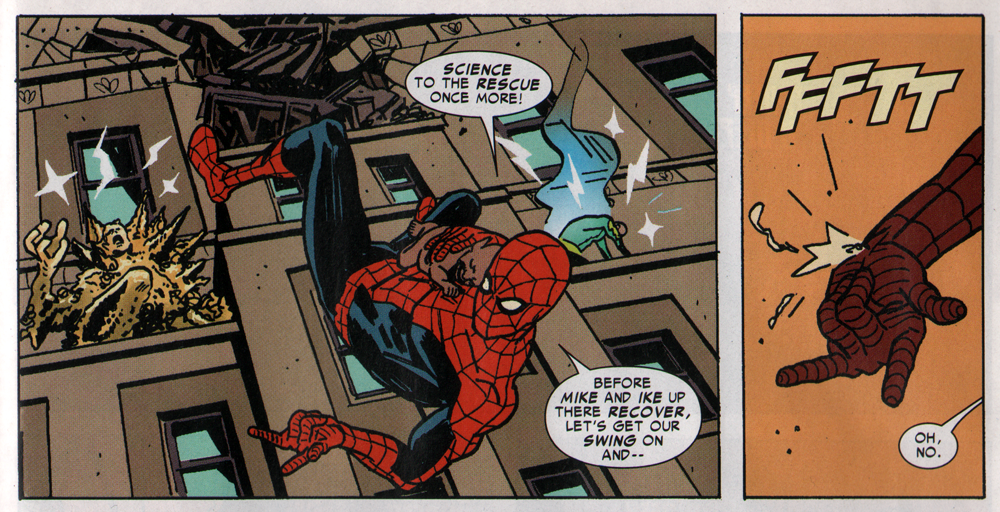
Waid also wisely moves the bulk of the action out of the confined space of the Coffee Bean and into the environs of Manhattan. Placing the last issue indoors made for some cramped, awkward action. While the art is still not my cup of tea, allowing Azaceta more space (literally and figuratively) to be creative with action layouts means that the artwork is more dynamic. Spidey is swinging, dodging lightning bolts and blasts of sand, avoiding helicopters, and leaping off of buildings. That is how you do Spider-Man in action!
This time around, we get an idea of what’s going on in the characters’ heads. Quite frankly, I think the way that comic books are written today forsake the issue-by-issue reader in favor of the trade reader, and this is a perfect example of that. We learn why Lily sought out Harry (she needs him to hide her), we find out what sort of flimsy promises Doctor Diaperpus made to the supervillains, and we learn why the authorities are interested in the scenario. This is the sort of thing that should be established in the first issue, but it’s good that they put it in here – it helps to break up the pace of the issue nicely, delivering us information alongside the wall-to-wall action. We also see that Harry still cares for Lily through his willingness to help her, a little character moment that goes a long way.
The Bad
Carlie Cooper gets more annoying every time I see her. In this issue, she outright abandons Lily to look for Peter, even after she’s called out for acting like an asshole. The intention appears to be showing that Carlie strongly cares for Peter, but instead, it makes her look like a cold-hearted bitch. (She also manages to pick up one of the most obvious Chekhov’s Guns in a long time during her brief appearances in the issue.)
The artwork is a mixed bag. Azaceta’s layouts are great, but his illustration of the pages is terrible. Character faces are grotesquely ugly, his Spider-Man leaves much to be desired (though he thankfully shaved off a few pounds), and his linework is wavering and amateurish. Honestly, a lot of these problems could be fixed with a solid inker – it’s something they should consider in the future.
While the story is very entertaining and well-written, there are a few contrived elements. Once again, we get an inconveniently-timed empty web-shooter to add some false drama. Thankfully, it was resolved quickly. And of course, when Spidey is thinking of places to go, the Fantastic Four are out of town. More significantly, however, Spider-Man doesn’t use the extreme media coverage to his advantage. If he told his point of view to one of the many dozens of video cameras aimed at him, he could alleviate some of the pressure.
The Ugly
While I love the Djurdjevic covers for this arc, finally having two in my hands proves to be a disappointment. Let me explain: the connectivity of one cover to the next has been botched. There is clearly a strip of the artwork missing, so the covers don’t line up properly. (Go ahead, try it out if you have these covers – they don’t match.) Marvel had a similar problem with Ultimatum’s connecting covers that was so bad they decided to release the last issue with a gatefold, wraparound cover of the full piece. They may have to do the same thing with this piece.
It’s not difficult, people. The board that artists use to draw pages and covers has the cutoff lines printed and marked on them, so there are no excuses. None.
The Bottom Line
This issue is a vast improvement over the previous one. With better artwork, this could have been one of the best issues of Brand New Day. 3.5 out of 5 webheads.


The art is crap, and spidey carrying around a newborn naked baby for to issues is pathetic!!! At least cover the kid up!
The main reason the art looked better this time is that Spider-Man keeps his mask on. It was Peter’s face in the previous issue that really brought that issue down. It’s a shame. A flagship title like Amazing deserves the on of the best artists in the company. We’re getting better art in the Marvel Adventures line (and sometimes better stories).
The art is terrible. At least Spidey doesn’t appear to be fat like he was in the pics shown in the last review.
For shiggles, I tried fititing the Djurdjevic covers, and you’re right, they didn’t fit.
But, would those use the same type of artboards as standard pages and covers?
Seriously? A Devil Dinosaur Marvel Babies cover?
Seriously?
Guys, you should get the poster with Djurvjevic’s art instead of the variants. You’ll thank me for it.
@Javi: I honestly have no lasting reactions to those Spidey Sundays strips. I don’t even think of them when writing the reviews.
But now that you mention it, the only thing I can think of is how terribly Marcos Martin drew her. Her head looked like it was going to twist off. 😛
no comment on MJ’s appearance in Spidey Sundays? Especially as Stan poked fun at her continuity?
Let me rephrase that… the art was a slight improvement… the story pace was great.
I agree with the reviewer and thought the story pace as well as the art were slight improvements than the last issue.
I see we’re back to the era of disappointing interiors. Nothing against Martin, but I’m sick of the “false advertising” cover art of comics nowadays.
By the way, what’s with that upcoming Spider-man vs. Vampires? If Spidey ends up skewering vamps through the chest with his wrist stingers I’m in.
Here’s hoping that lightning strikes twice for the next issue, harder hopefully.