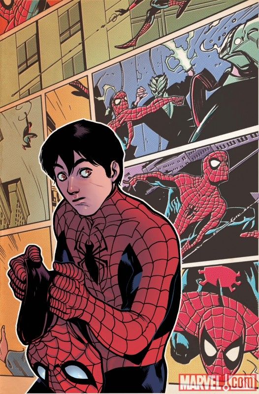
COVER BY: Rafael Alberquerque
WRITER: Bob Gale and Fred Hembeck
PENCILS: Pat Olliffeand Fred Hembeck
Those of you who couldn’t read this because it was “digital only”, turn that frown upside down! The former “digital exclusive” comic is now being released as a print series. Worth it?
The Basics
Bob Gale is back in this “digital only” comic. Well, it was suppose to be digital only but I think Marvel figured nobody was reading it so they decided to release it in the comic shops. Michelle tricks Peter into promising to financially assist with the redecoration of their apartment, high school rejects get vow revenge and Mayor Jameson teams up with a Paris Hilton knockoff (seriously).
What everyone is talking about
For all intents and purposes, this looks like another ongoing series and not a mini. Why did we switched to “Amazing” three times a month again? Wasn’t it because they felt the satellite titles felt less important? We now have Amazing (3x), Peter Parker, Web and a few different mini-series. This isn’t even counting the out universe titles like “Ultimate” or team books. I like more Spider-Man just as much as everyone, but I’m starting to see old patterns repeat themselves.
The Creators
Bob Gale had less than spectacular reputation among Spider-fans during early “Brand New Day”. Anyone remember Freak? Perhaps the time off and change of format did Gale good. The writing isn’t anything that will knock you out, but I found it to be an enjoyable read. Pat Olliffe is on board for art and I couldn’t be happier. Olliffe has a history of drawing great Spider-Man stories and he keeps it up here. I find his art to be the just right fit and it’s not too wacky, dark or cartoony like some of the rotating “Amazing” artists have been.
The Good
* As you can read above, Pat Olliffe draws a great Spidey. Nuff said.
* Actually playing with the fact that JJJ is mayor.
* New villain called the Spectrum has the power to…..change colors? Actually it’s not that bad visually. Perhaps future issues will make this villain seem less lame, but the concept is nice.
The Bad
* We are shown the “unpopular” girls in high school. It’s a common tv, movie or comic trope that the unpopular people are actually quite attractive and it’s really annoying. I am tired of seeing movies where people like Jennifer Aniston complain about not being able to get a date yet they have a smoking body. It’s the same situation here. I find it very hard to believe that three girls who look like they do would have a hard time being popular in school.
* This was originally a digital comic published online months ago. Now that it’s released it’s place in continuity is confusing. When does this take place? Luckily it’s easy to workout due to the text, but it takes some pondering before you figure it out, especially given Michelle and Peter’s “relationship”.
* JJ teaming up with a Paris Hilton knockoff??
The Fun
Fred Hembeck wrote and illustrated a back-up story about “Petey”. “Petey” is a cartoony out of continuity feature about Peter and the Marvel Universe cast before they got their powers. It’s a fun feature, but nothing special. Mostly the characters getting into situations that foreshadow their future roles like Johnny turning on a lighter saying “flame on” and people saying that Sue came out nowhere like she’s invisible. Get it? Nothing that will win an Eisner, but will make you smile.
The Final Word
3 out of 5 webs. Mostly due to Pat’s art. This issue was better than some of the current issues of “Amazing”, but it mostly gets the grade it does due to the awesome Olliffe artwork.


Fred Hembeck rules. Rules, I say! I have read PPTSSM #86 probably two dozen times.
I read it in the digital format so its been a while but the inside art is very nice, Peter looks “normal” not like the 13 year old on the cover.
I cannot stand the cover. Peter looks like he’s 13. I’m not picking this up so can anyone tell me how he looks inside the book?
I know this is going to sound petty and all- but the little gaffe in the beginning about the color annoyed me. Michelle says one thing, eventually Peter agrees with her but calls is something different, and then the coloring in the background doesn’t actually match EITHER of their wording!
I actually read that 1 page like 3 times because I was convinced that I had misread something, but I don’t think it’s me…
I actually loved the art of this issue, as well as the art in #2. This title is on my pull list.
Nice review. I agree with you.
Except I don’t really like Pat Olliffe’s art. Especially the faces he draws.